Art and Identity Design for Mobile Game App
The Brief: Create a distinct and unique identity for Ninja Climb. This includes logotype, an app icon, and in-game assets.
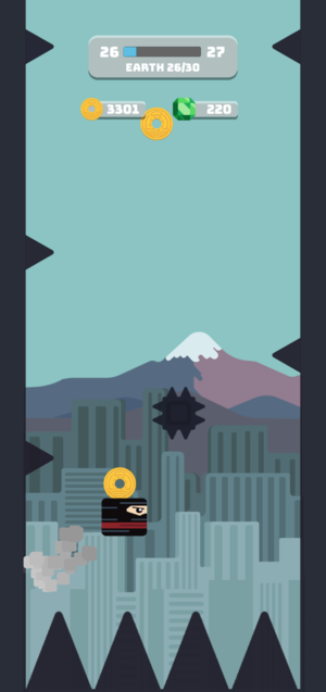
Context: Ninja Climb is a fast paced, casual game that relies on communicating information in a stylish but efficient way. Players play as a ninja jumping between walls and avoiding obstacles like spikes, saw blades, and collecting coins.
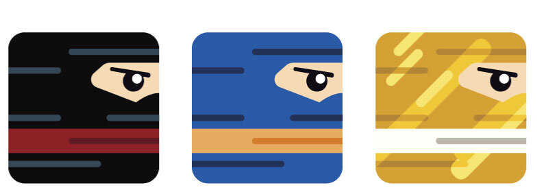
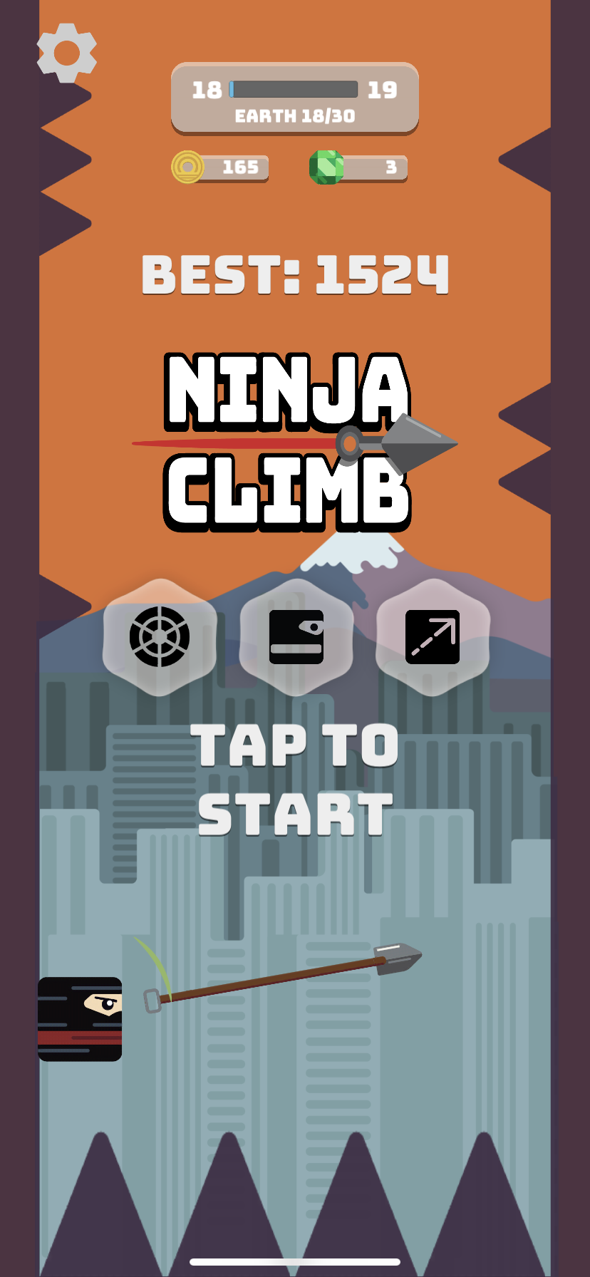
Visual identity for Ninja Climb was based upon two core thoughts for the games brand: Bold and Ninja. Bungee was the choice for font because of its rounded corners, strong implied momentum, and its readability while being bold. To integrate the game elements more directly I included the Shuriken, it game more implied movement and allowed for some implied depth to the composition. The Font was outlined and slightly offset to imply shadows, and capture the idea of a ninja sneaking around behind the letters. This logo was used in the app directly as well as on the developers website for advertisement. The font was used throughout the game, and the shuriken, as mentioned, was an asset which I brought in.
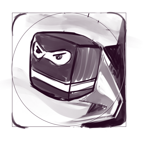
Initial sketches for the icon that I created to present to the client. The first was to replicate design trends in the mobile app market, which emphasize characters faces and engage with the user. This icon design is both tried and true, and tired, and as a safe bet, was rejected on that principal alone. The middle was a more active composition but emphasized the motion of the character and not the actual method of play, which led us to the third and final sketch which was a dynamic composition which could be modified and filled with the objects from the game world.
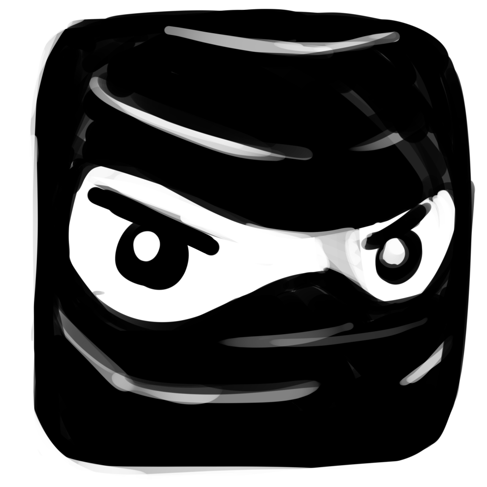
The App Store Icon
The app store icon is perhaps the most important part of a mobile app’s success. This icon is displayed in the iOS app store and on Google play, and is the first point of contact for players. This icon required a lot of work to keep it both consistent with the established aesthetic of the game while emphasizing and realizing a more 3-D version of the main character. I chose to incorporate the dangers presented in the game and the excitement of dodging spikes and saws, it emphasized the game-play and entices players to click and check out the game with the blocky looking ninja.
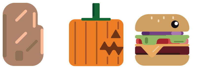
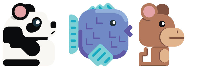
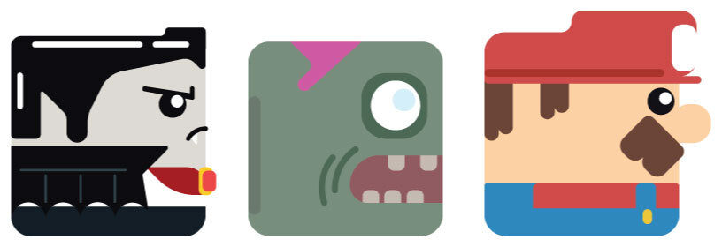
Character Design
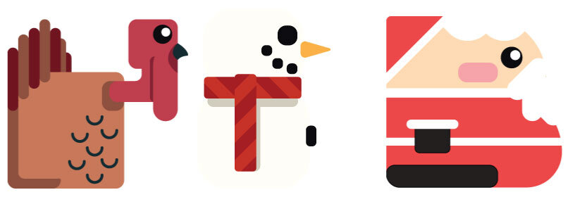
I designed 40 characters for the game to be unlocked by the player as they play. Each of these characters was designed to solve for a players want, whether that is a seasonal character, an homage to another game, a piece of food, or an animal. Each character was designed to make players crack a smile and decide to try out playing as a T-rex, a snowman, or a potato.


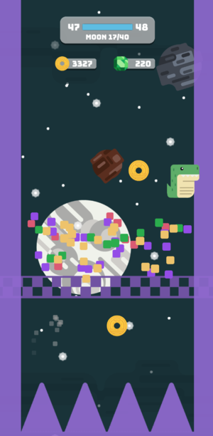
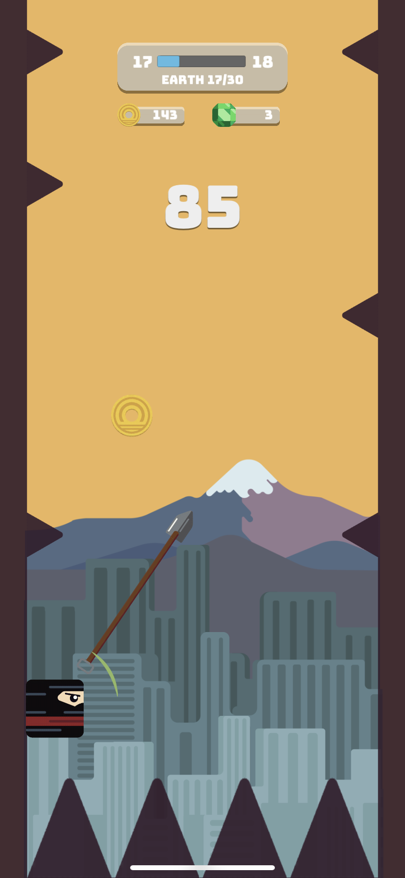
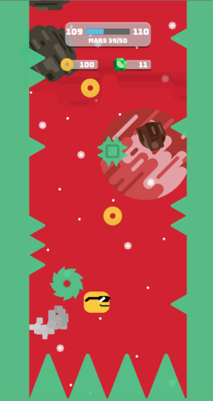
Screenshots of the game running on devices.

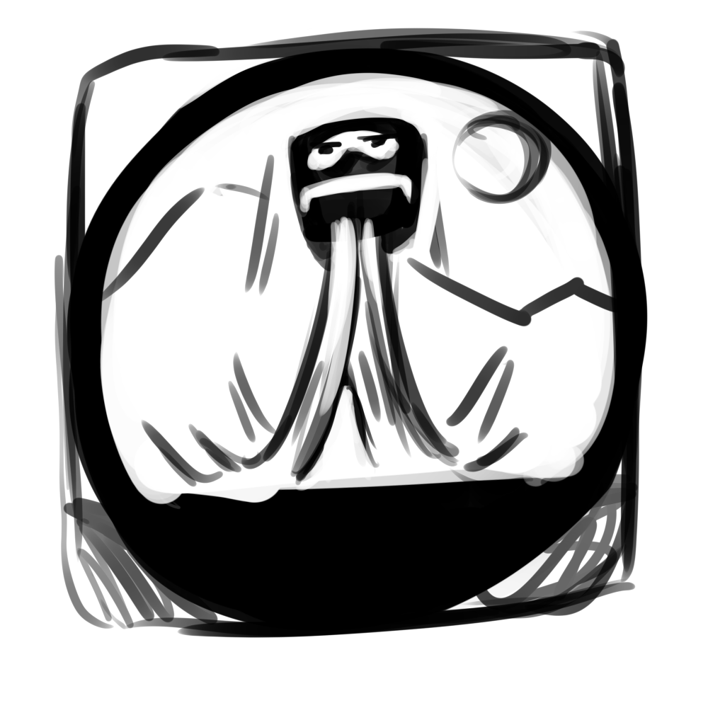
Game Intro Assets
This is a mockup of the game’s intro using assets I created. The idea being “Ninja Heaven” The player is placed here at the start of the game and then falls to the beginning, showing a brief overview of the rest of the games levels as they go down.
The Game Trailer. This was not created by me, but features assets created by me.